LIMITED-EDITION, 112-PAGES OF PHOTOS, HARDCOVER
TAKE A LOOK INSIDE THE NEW SLOW & LOW BOOK!


about the book
-
This is the first edition printed as a limited edition of 1,000 copies.
Hardcover
144 total pages | 112 pages of photos
This photo essay book was printed in full color, with each photo receiving a spot gloss varnish on an already high-gloss, coated paper. The ultra-shiny quality increases the vibrancy and saturation of the candy-colored cars while offering each image a tactile, family photo album feel. The front and back matter of the book are printed in silver ink on natural paper, creating a contrast that heightens the reader's attention to the material intention of the book and the cars. The silver ink maintains a reflective quality akin to the engraved chrome of lowrider cars and viclas.
Typographically, the body of the book is set in Canela, designed by Miguel Reyes at Commercial Type—a graceful typeface that, like lowriders, defies traditional classifications. This type is set with a sense of physics. Each column of text baselines to the bottom of the page and rises to hit different heights—a gesture likened to the hydraulic bounce of a lowrider. The display type is Respira, designed by Lucas Sharp with Wei Huang at Sharp Type, a typeface inspired by blackletter—a style prevalent in lowrider and Chicano cultures.
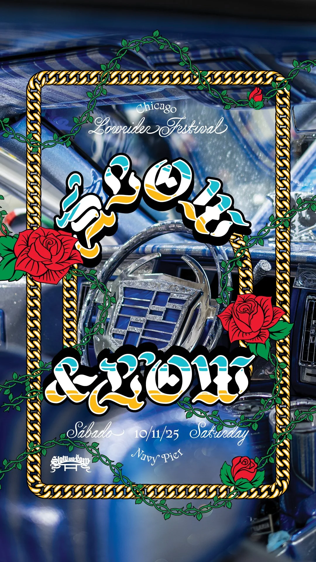
Stark and dramatic, the cover’s vertically stacked black letter type is stamped onto a black textile texture with white foil. The form is reminiscent of the letter-based tattoos that read top-to-bottom on many in the lowrider community's forearms. Words composed like this are also often seen in churches, hanging from banners above the altar—an appropriate reference given the importance of faith among lowrider community members. The Smyth-sewn binding allows the book to open flat, minimizing how much of an image falls into the gutter. The book ends with a collection of 360 silver ink photo booth photos featuring over 1,000 members of Chicago’s lowrider community, all taken at the 2022 Slow & Low festival at Navy Pier. In this respect, the book’s back matter functions like a yearbook.
-
$65.00*
This is the first edition printed as a limited edition of 1,000 copies.
Hardcover
144 pages
*credit card processing fee applies
*+ shipping costs
-
This first edition was printed and bound as a limited edition of 1,000 copies.
Published by Slow & Low in 2023, in Chicago, in the United States of America.
ISBN 978-8-218-24976-2
Copyright @2023 Slow & Low
-
This book was designed by Span’s Nick Adam and Cheryl Kao, with assistance from Grace Song in Chicago on Lake Street.
It builds off the styles used in both Slow & Low festivals held at Navy Pier (2022 & 2023).
The design work was produced with the vision of Peter Kepha and Lauren M. Pacheco.
View > Slow & Low Navy Pier Exhibition Identity designed by Span
-
This book’s photographs were by Carmen Ordonez, Carolina Sanchez, Don’t Get Shot, Edward Magico Calderon, Fernando Ruiz, Katrina Nelken, Manuel Lagunas, Manuel Velasco, Max Herman, Mike Pocious, Nick Lipton, Peter Kepha, Sebastian Hildalgo, and Nick Adam.
All images were used with their permission.
-
Canela - designed by Miguel Reyes at Commercial Type in New York City. A graceful typeface that, like lowriders, defies many traditional classifications.
Respira - designed by Lucas Sharp with Wei Huang at Sharp Type in New York City. A typeface inspired by blackletter type and lettering founded on ancient manuscripts.
-
O.G.M. in Padua, Italy.
Cover
Wibalin Buckram
Paper
Arena Rough Natural 140 gsm
GardaGloss Art 150 gsm
-
Dr. Ben Chappell
Ethnographer, Cultural Critic & Professor
+
Lauren M. Pacheco
Co-Founder & Curator
-
Generously funded by the Builders Initiative.